MyCity
Role: UX Designer Company: NYC OTI Year: 2022
The MyCity platform will be a public-facing internet portal designed to serve as a seamless and intuitive experience for interacting with all of the City government. MyCity will be a unified intake tool that enables New Yorkers to find and apply for City services, as well as check the status of City services they have applied for, all without ever having to learn the City’s complex org chart of agencies and officials.


The Problem
For many New Yorkers/families, applying online for subsidized child care can be confusing, frustrating, and time-consuming.
The current application process cuts across multiple agencies, and several websites involve a wide array of complex instructions and rely heavily on filling out many forms.
This situation has discouraged many eligible families from applying for childcare, as well as contributing to a high failure rate of applications for families that do apply.
The Solution
Our goal is to ensure that parents, caregivers, and guardians can check if they are eligible for subsidized child care and apply for it
The Office of Technology and Innovation (OTI) is currently developing this product and its team of user-centered designers administers qualitative research to understand New Yorkers who may use this product in the future.
By engaging with end users throughout their development process, to ensure that the articulated needs of users are reflected in the final product launched by the City.
To achieve this I ...
Implemented Competitive audit of other States' and countries' public service portals to understand how they organize large data for users to navigate and apply for benefits.
Synthesized data from the stakeholders about the existing internal process behind the scenes, What happens, When it happens, Who does what, and What technologies are involved? And timeline.
Researched and created Service Blueprint Designs of the "current state" of City Services (ACS, DSS, HRA, DOE)
Wrote an interview guide based on the needs of design scope and user criteria for a DSS research panel of participants who are parents or caregivers of children.
Conducted and observed In-depth interviews with questionnaires, and collected feedback on an interactive prototype.
Before
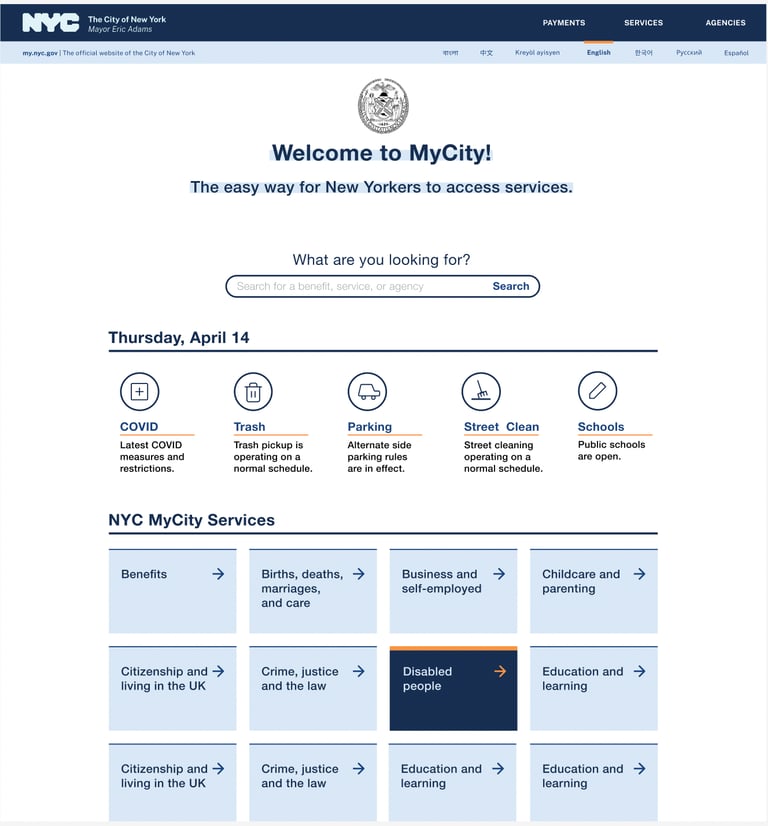
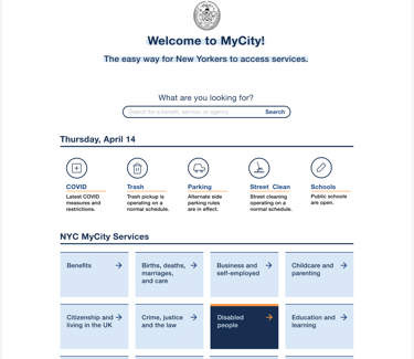
After
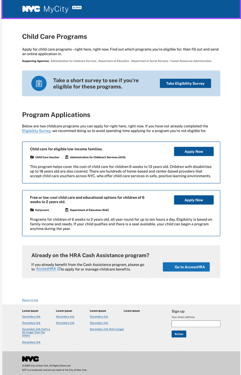
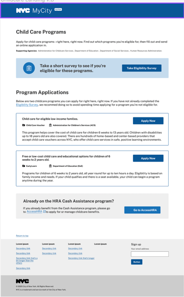
I started with a couple of excel spreadsheets about the process and recordings of Teams interviews facilitated by executives from Mayor Eric Adams's office Interviewing Heads of departments from six different city agencies. (ACS, DSS, DOE, HRA)
Rounds of usability testing. I was confident that this design was going to improve the user experience for our New Yorkers applying online for childcare services because the last round of testing showed a 20% increase in application completion
After meeting
After defing the problem with stakeholders the team decided to tackle four main points that were most critical:
1: New Yorker parents and caregivers may find, apply, and get status updates on their childcare eligibility status, all at one digital location.
2: MyCity will screen the parents and caregivers in order to give them informed childcare options.
3: Once they have chosen a childcare option that works best for them, they can apply for that chosen service directly online.
4: After a childcare application has been submitted, the parents and caregivers can return to MyCity to check for updates on their eligibility status.
Research
Stakeholder Interviews
Competitor Audit
Remote User Interviews
Service Blueprint Design
Usability Testing
Usability Testing
The OTI team is looking to speak to:
Parents who have already applied for ACS or DOE childcare
Parents who have not yet, but may soon, apply for ACS or DOE childcare.
A couple of childcare providers and/or welcome centers
All selected participants will be compensated for their time through gifts cards; sessions can be remote or in-person.
In-depth interviews with a questionnaire, and collecting feedback on an interactive prototype
Identify and prioritize pain points
"The most frustrating part of the process was understanding how it works."
Slightly confused about the Eligibility Survey box and the How it works section (“Is number one the same as the blue section?”)."
Users currently perceive applications as a long physical process with alot of paperwork
Fear of leaving the application because progress cannot be saved
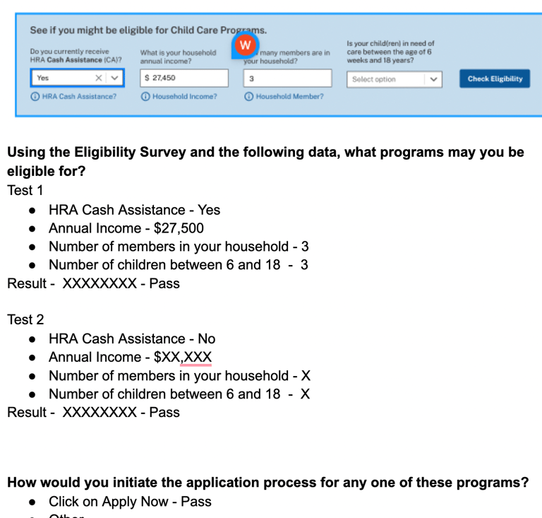
After interviewing and observing participants, and listening to their thoughts, we review the feedback notes and videos. Next, we decide how to go forward
Research Conclusion
Make updates on findings and schedule another round of interviews for user testing we used usertesting.com
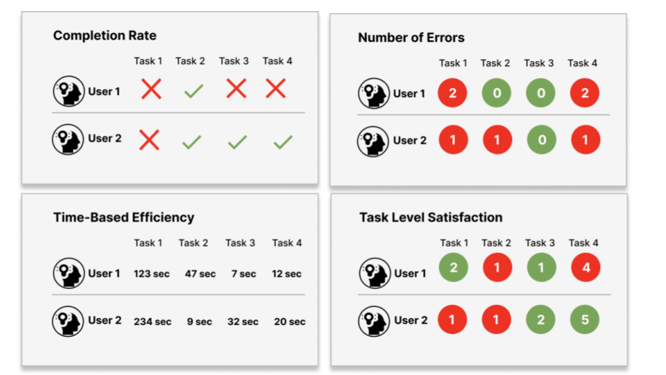
Ideating the solution
Wireframes
Lo-Fidelity flow for verifying benefits
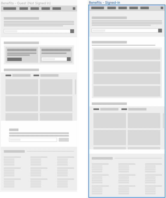
Purpose: Get users to sign up for an account so they can see personalized benefits and manage any active benefits they’re using
Purpose: Show user which benefits they’re eligible for (based on the information they’ve given us via AccessHRA), and how they can manage their active benefits
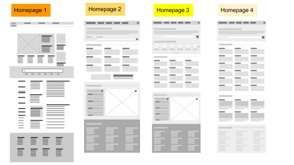
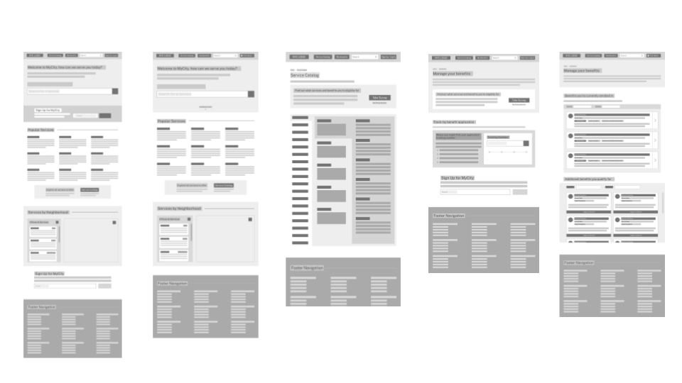
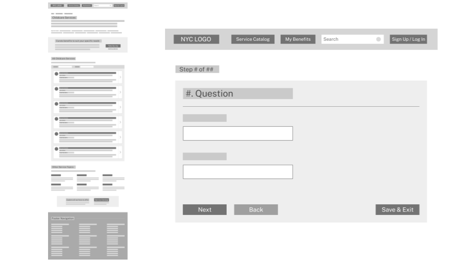
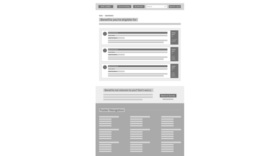
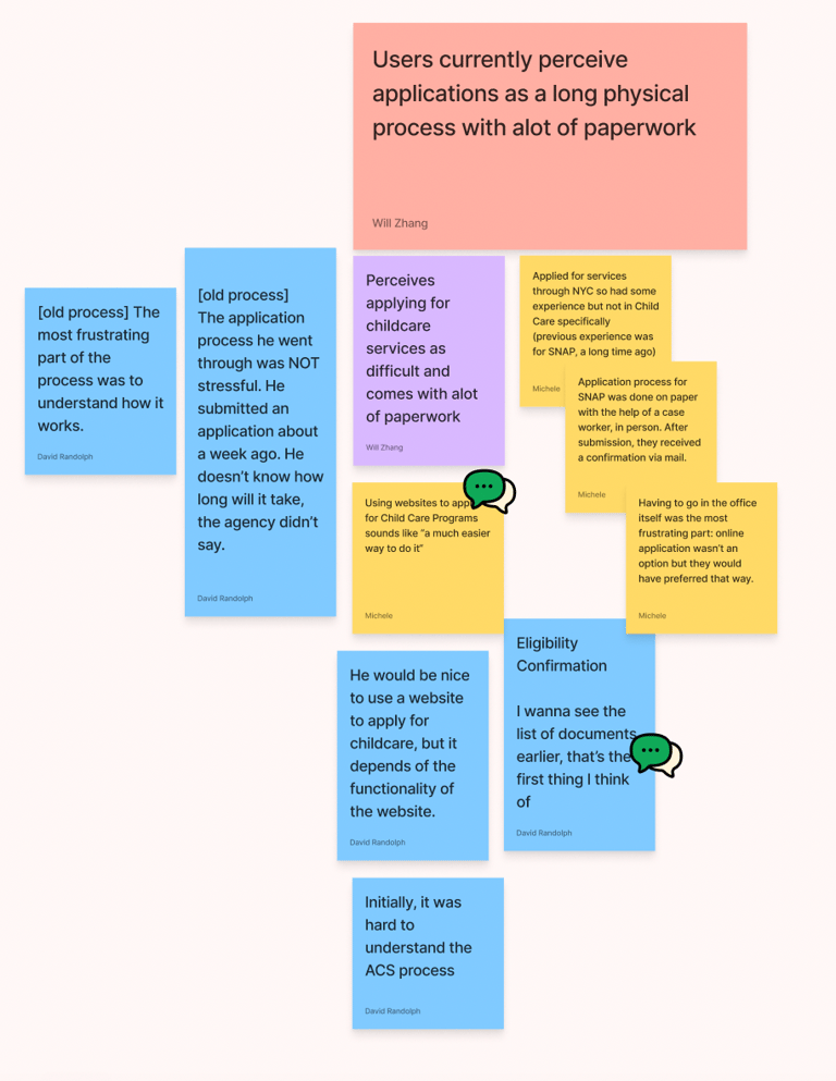
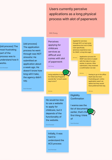
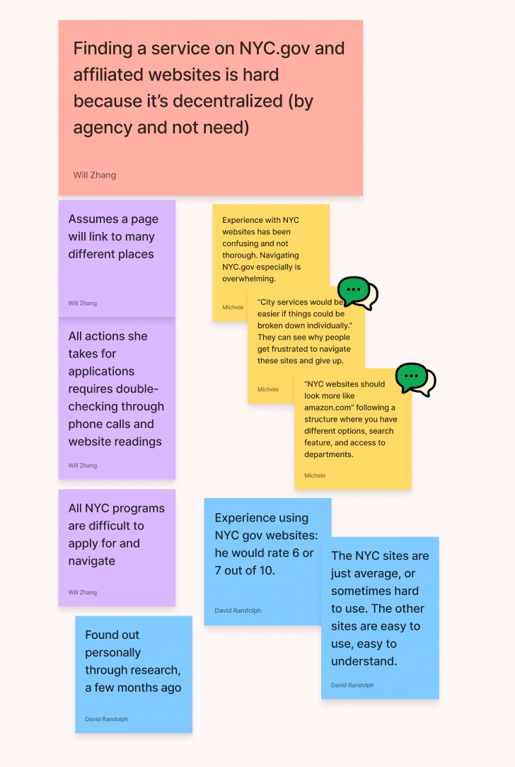
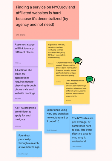
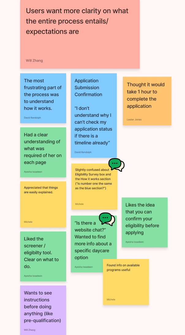
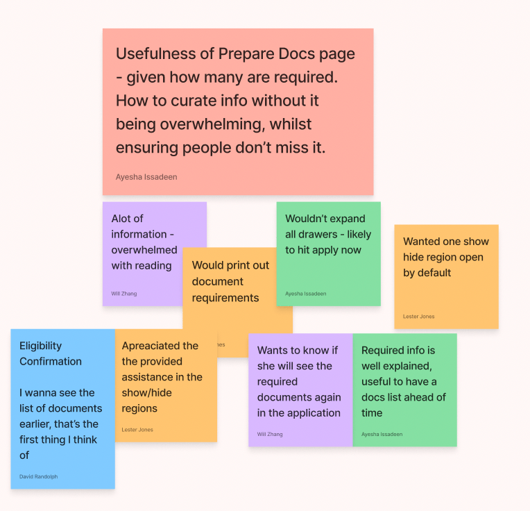
Synthesize data from user interviews with participants of the team here in these images with post-its
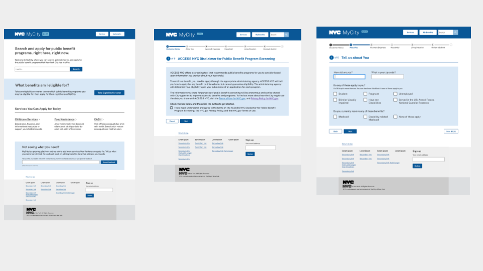
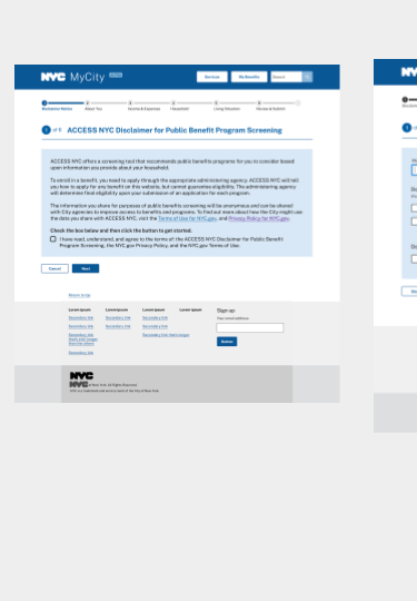
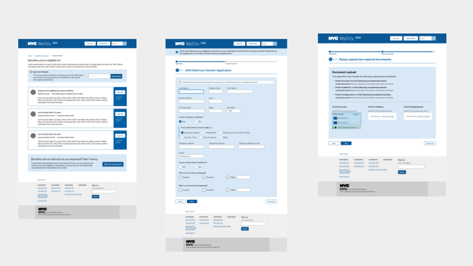
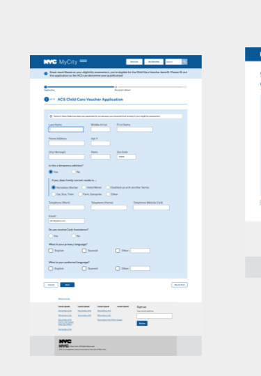
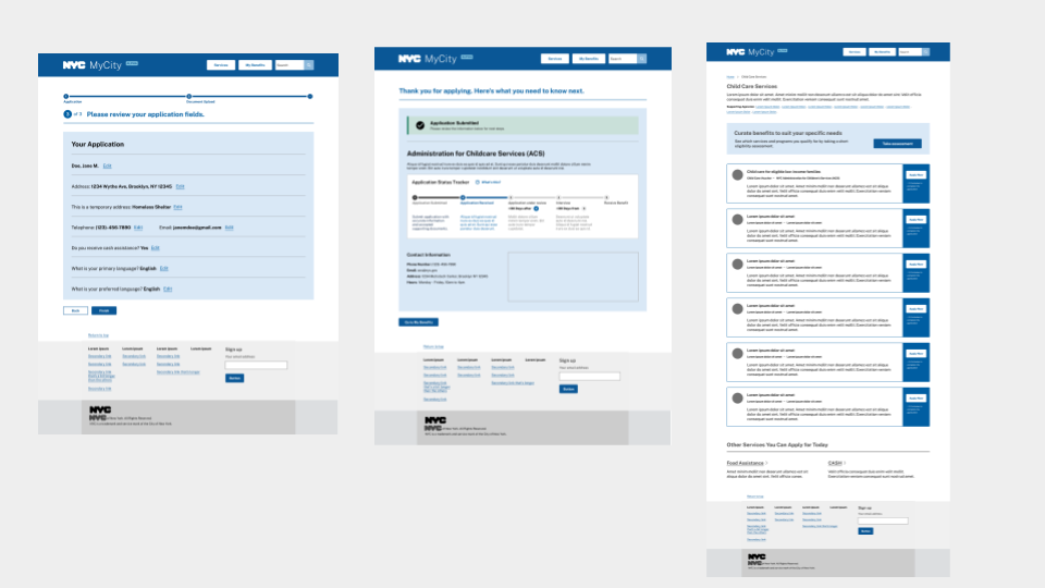
Hi Fidelity Wireframes
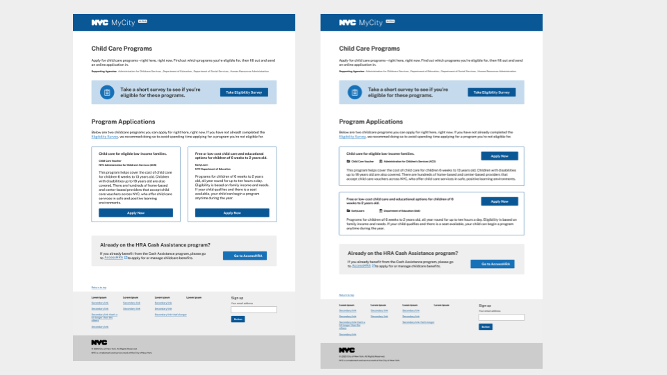
Technical Limitations
I faced a few technical limitations throughout the project.
Finding a way to consolidate so much required information without overwhelming New Yorkers.
One of the departments is low-tech and uses postage mail only to communicate with customers.
Seamlessly downloading and transferring data from the site to share with other NYC departments.
Proven the solution
After rounds of usability testing. I was confident that alpha was going to improve the user experience for New Yorkers because:
40% decrease in drop-offs
15% increase, New Yorkers completing child care enrollment process
60% increase, New Yorkers understanding of how to navigate the homepage
