Redesign
About this project
Healthy Habits is passionate about providing a healthy and delicious meal delivery service that is perfectly suited for healthy weight loss while preventing chronic diseases. We updated the current design to make it easier, adaptable, and more flexible meal plans for individuals with special needs that want to maintain optimal wellness. Healthy Habits uses proper nutrition in food as medicine
My Role
I worked as a UI/UX designer, and UX Researcher on this project while in New York. At the start of the project, I researched food commerce and how people shopped on mobile. I mapped our mobile strategy for Healthy Habit's digital clients. Along the way, I created the site map, user flows, and wireframes prototyped functionality, and wrote specifications for design and behavior. In this iteration, we are looking for ways to improve the design. Healthy Habits wants to majorly change its design by eliminating the pick-up option on the existing app and going 100% meal delivery service.
The Problem:
Healthy Habits will no longer be working from a restaurant as originally planned. This change will impact the app as stakeholders' vision is to update the app to delivery only by removing the "pick-up" feature.
The purpose of this redesign is to update:
Remove the "Pick-up" feature
Simultaneously we want to improve the checkout process based on user feedback.
Having a process helps me to understand where to improve
Change is a process. When designing a product, it's impossible to set up a rigid process I need to be agile and quick to adapt. I followed the outline of the "double diamond" design process for the redesign and if the results are not pleasing everyone, I can go back and analyze what went wrong and improve the process.
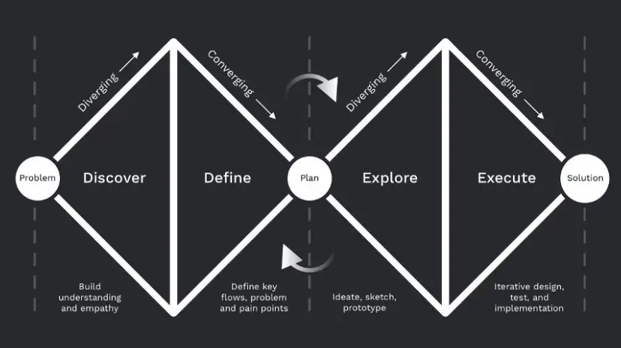
Start with building a shared understanding
As a designer, I want to be on the same page and unite over one common goal with stakeholders. First, interview stakeholders to understand what and why we are trying to achieve for the business and what timeframe.


I'm interested in the following:
Why would users choose this product?
What do you love most about this product/flow/feature?
What do you hate most about this product?
My goal is to carefully inspect the current design, try to understand how it works, and the intention behind each design.
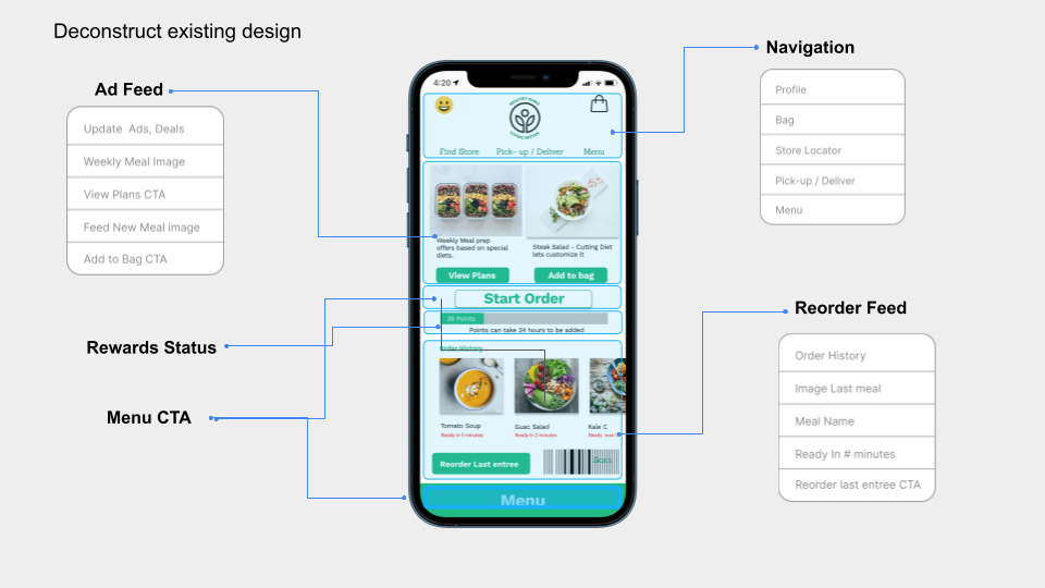

Deconstruct Existing Healthy Habits Design
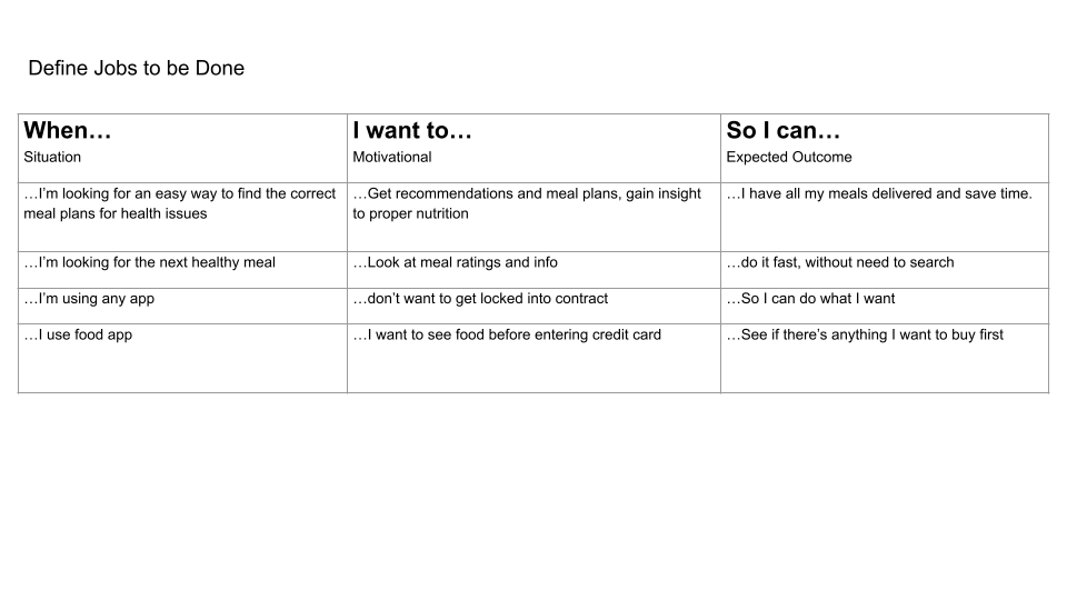
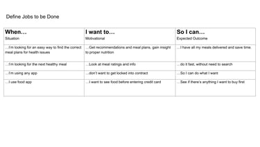
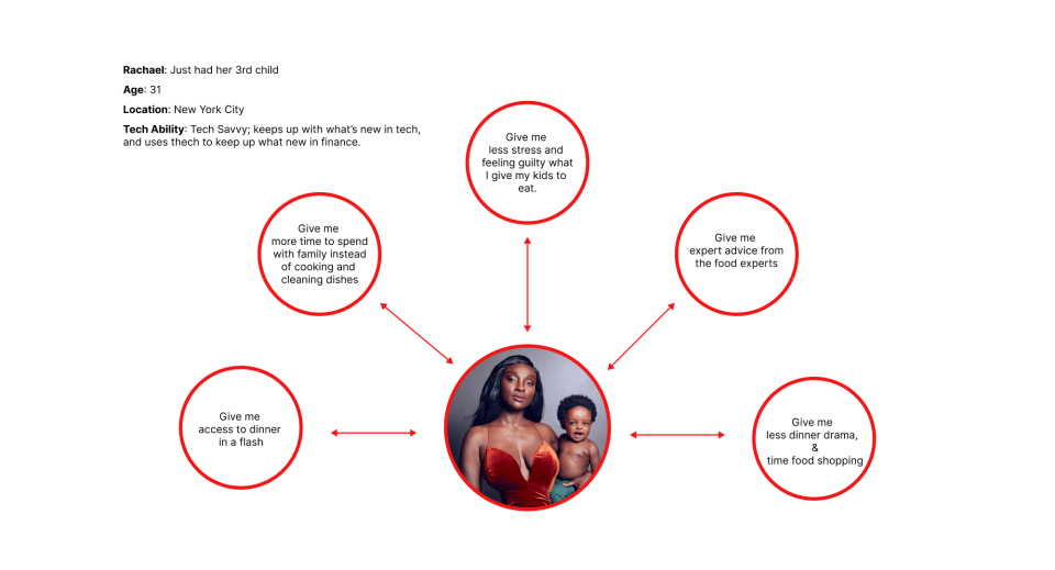
There are many methods you can do to better empathy. User journeys and value propositions are beneficial, but sometimes there's no time to do them if it's something small. Personas, help the designer tap into empathy but... An essential thing that I do is list the jobs to be done. This method helps me quickly understand user motivations and expectations.
Define jobs to Be Done
Paul Story
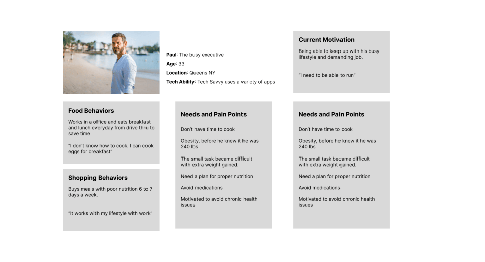
Paul is used to running his busy lifestyle with fast food to go. For the past year, he has been enjoying the ease of the drive-thru at his job to save time. He saw some weight gain and difficulty doing simple tasks due to the weight gain. but after going to the doctor He was shocked to hear he needs to start taking medication for gout, and high blood pressure and be aware he has borderline diabetes. All are related to poor nutrition. He wanted an alternative to medication and needs help but didn't know where to go, he knows how to cook eggs but he doesn't have time to cook or shop. clean dishes. He needs to run. He notice his neighbor who lost about 30 lbs and after a quick chat the neighbor told him about the Healthy Habits meal plan

Users will be able to pay the charges via Debit / Credit Card, the update integrates with PayPal and Apple Pay as well. The order request will be sent to the fulfillment center and the delivery agent will deliver the order to the customer-ordered location. Users can give reviews to the restaurant and agent.
Users & Audience
One of the first questions that come to mind is what are direct competitors doing. What are they doing well? What are they doing wrong and consider solutions in my design where competitors lack? Or received critical reviews and recent reviews of app performance. Look at things in common, maybe similar flows. I look at the reviews to see where the app ranks in the app store like in this illustration below. I may go to Twitter to see what people may say about an app. Define what is considered a standard experience for my app. I'll put together a vision board of screenshots, to get the vibes going. Digging and searching for the gold right now.
Review the competition
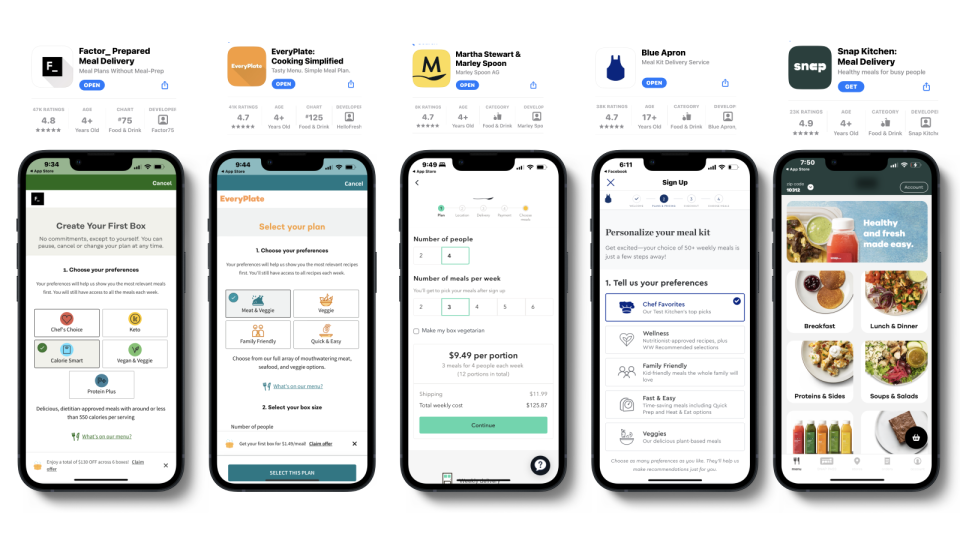
Understanding what each competitor's product is aiming for, and comparing those apps to mine will give a high-level overview of where you stand.
Understand where you stand
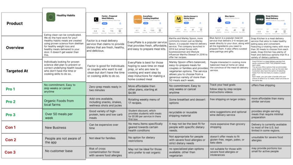
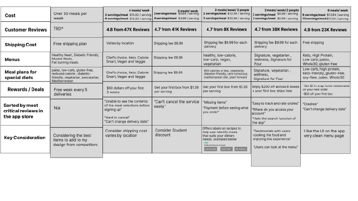
Once I have a better understanding with help from the data analytics, I can identify key problems with the current design, the redesign, and exotic solutions, etc.
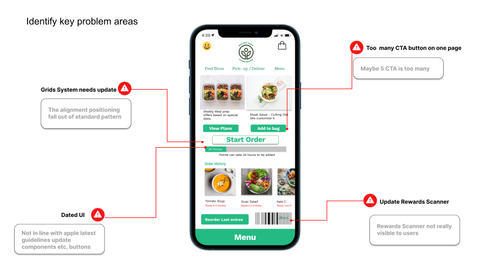
Once I have a better understanding with the help of data analytics, I can identify key problems with the current design, redesign, and exotic solutions, etc.
Identify key issues
After looking at the issues, the next step is to find solutions for each identified problem. Competitive research and exploration usually help by giving inspiration
Find Improvement Opportunities

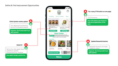
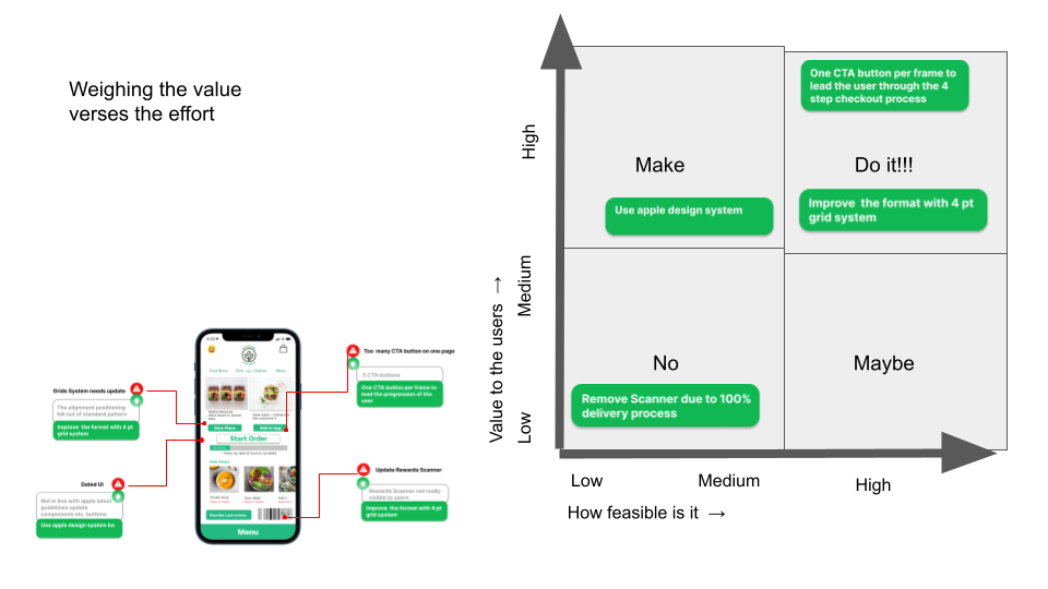
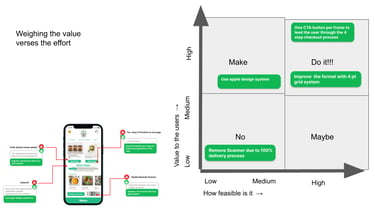
Having a list of problems and ideas on how to solve them is a good thing, I use this process to understand what are the low-hanging fruit. For each opportunity, we need to understand what it will take to deliver it and how much value we will add for the end user. Ideally, we want to focus on the upper right quadrant in the graph below.
Understand the Value vs Effort
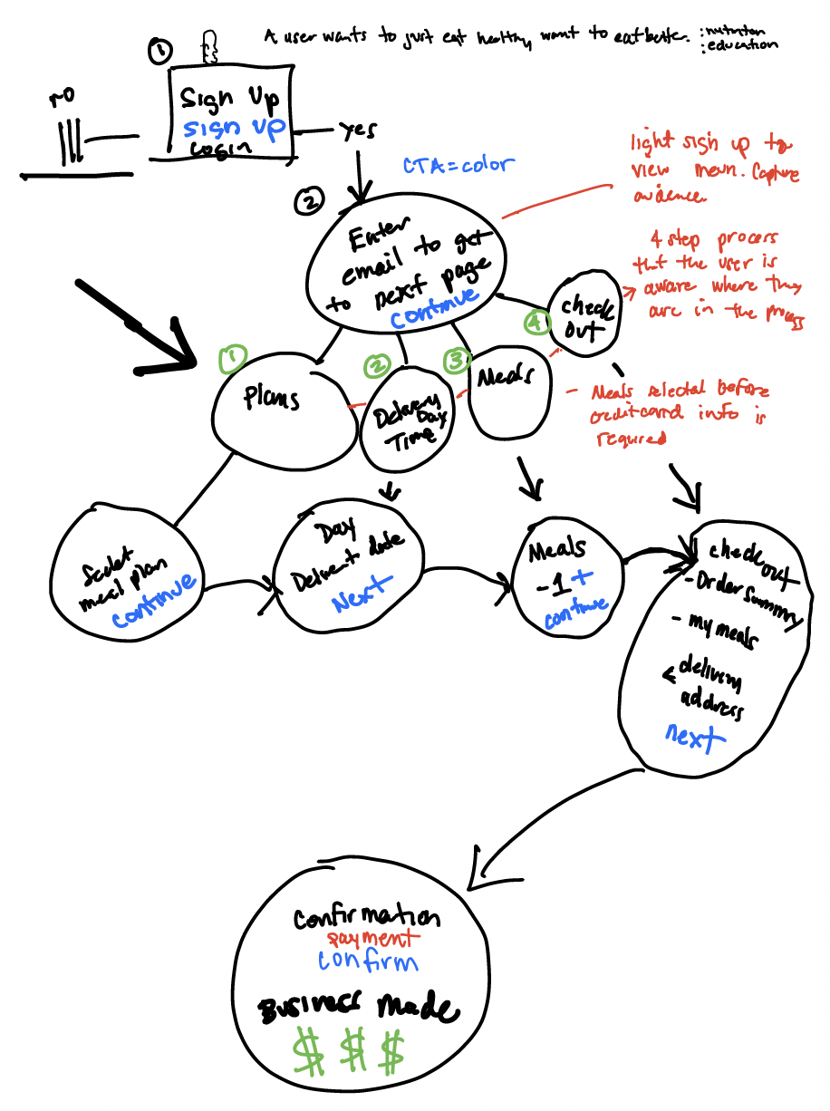
Choosing the right design method will set the tone of the entire design process. I map out a flow before doing any actual design work this helps me understand the user journey better. I use a picture of a linear sequence of steps that a user will walk through when performing an assigned task. Weapon on choice Ipad and Pencil.
Sketch on paper first with a task flow
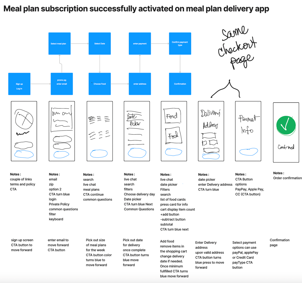
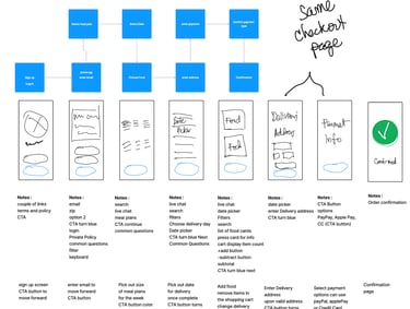
I like to line up the plan for the screen to deliver
Scope of work
Scope: Healthy Habits Customer Mobile Application
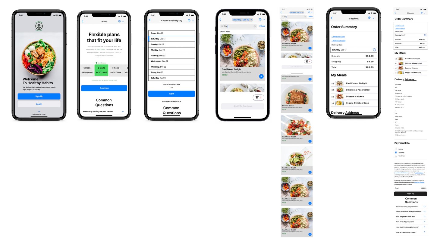
Splash Screen: The customers will be shown the logo and name of the application or the screen for 2-3 seconds. The customer will be redirected to the login screen after 2-3 seconds.
Walkthrough Banners: The Customers will view 3-4 sliding banners which will display important data regarding the application with the “Get Started” button.
Sign up via email screen
Sign up
Log In
CTA button
Swipe up to learn more
Common questions
Pop-up promo enter your email to participate screen
Enter email
Live Chat
Enter zip
CTA Button
Common questions
Select Meal Plan Screen
Select Meal Plan Size
CTA Button
Common questions
Choose a Delivery date Screen
Date Picker
Live Chat
CTA Button
Common questions
Choose Meals / Home Screen: The user can view the following information
Date picker
Filters
Live Chat
CTA Button
Add / Subtract meals
Cart Amount
Add the minimum quantity for meal prep to be prompted by my CTA button
Common questions
Order Summary Screen pt.1
Add promo code
Add gift card
Date picker
My meal summary
Enter Delivery Address
CTA turns blue once the address is detected in the field
Order Summary Screen pt. 2
Payment Info(PayPal, Apple Pay, Credit Card)
CTA payment option
Place Order
After the order is placed by the customer, he/she will be able to see the order view in full detail
Live Tracking
Order takeaway confirmation
Live order tracking
Live tracking of delivery agent
Order Status
Accepted - Accepted by Fulfillment Center
Confirmation - Accepted my delivery agent
On the way - The delivery agent picked up the order.
Delivered - The order received by the customer
Getting into the small details
User flows
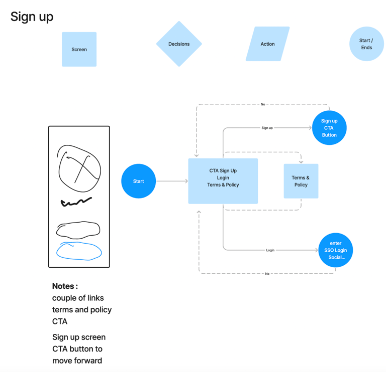
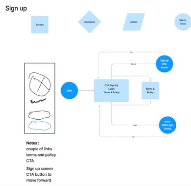

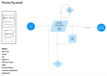

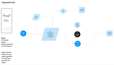

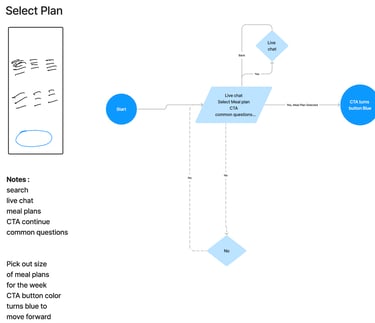
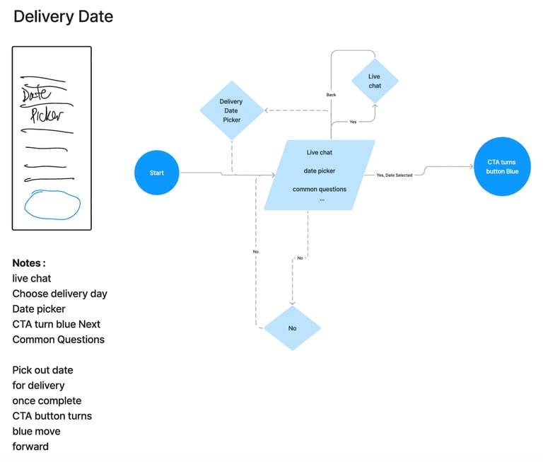
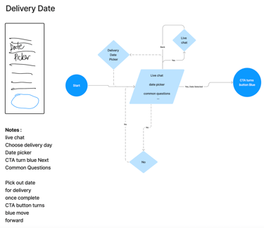
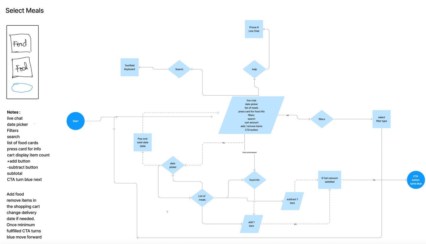

They say each hour spent on low-fidelity will save 10 hours from being spent on high-fidelity work later. sketch a quick idea of a flow, I go for a quick validation for the idea of flow. Starting feedback sessions with presentations of high fidelity. Have weekly Design Crits, and share them with stakeholders.
Get feedback fast, with lo-fi storyboarding

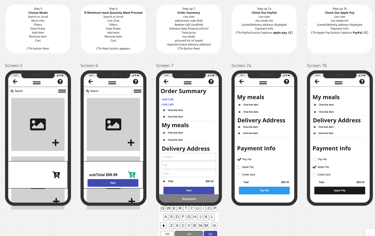
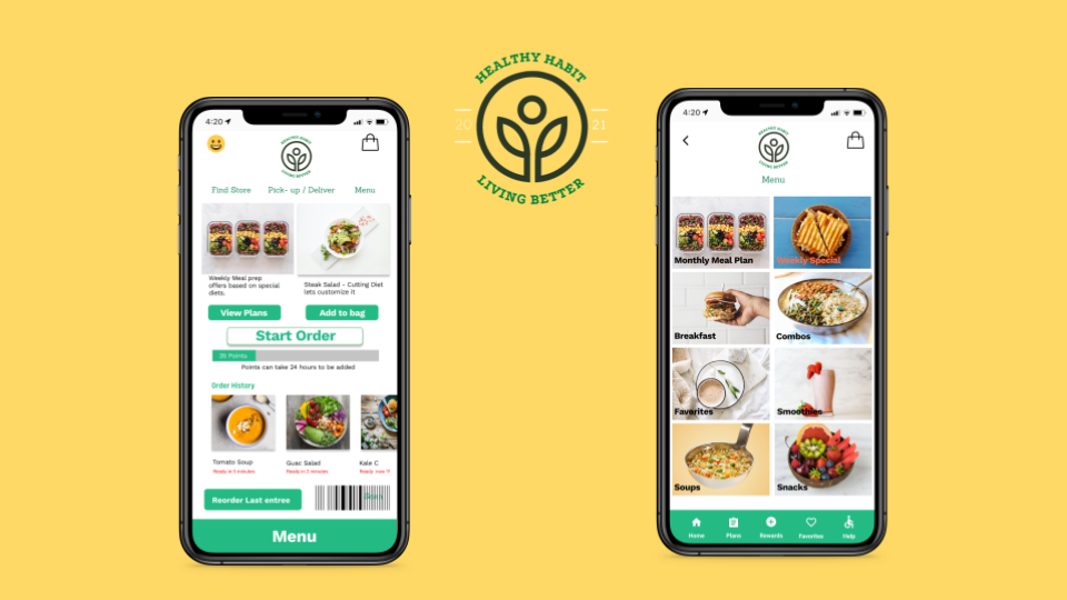
Here are some examples of the final mock-ups created
